
Reservation Flow
A conference-room booking flow for cove's Web Dashboard: six surfaces end to end, one built to production fidelity.
- CLIENT
- cove
- YEAR
- 2024
- ROLE
- Design Lead
- DURATION
- 2024
- TEAM
- Designer (me) · cove product partner
- STACK
- Adobe XD
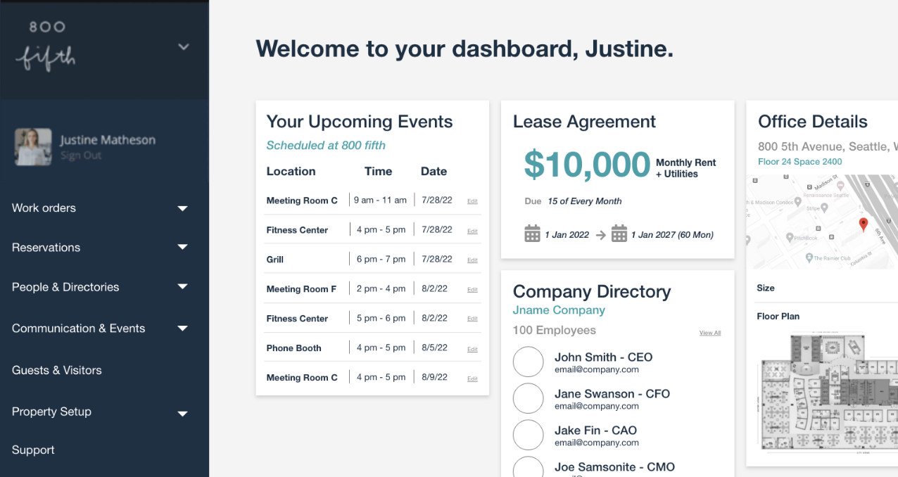
Click Reservations in the sidebar to begin. Pick a room, fill out the form, confirm. Edit or cancel any upcoming booking from the dashboard or landing page.
Welcome to your dashboard, Justine.
Your Upcoming Events
| Location | Time | Date | |
|---|---|---|---|
| Meeting Room C | 9 am - 11 am | 7/28/22 | |
| Fitness Center | 4 pm - 5 pm | 7/28/22 | |
| Grill | 6 pm - 7 pm | 7/29/22 | |
| Meeting Room F | 2 pm - 4 pm | 8/2/22 |
Lease Agreement
13,000 sq ft
Office Details
Suite 1200, New York
Company Directory
- JLJohn L. · CEOjl@email.com
- JLJake L. · CTOjakel@email.com
- JSJoe Samsonite · CMOjoes@email.com
Floor Plan
The Situation We Walked Into
cove is the platform behind shared-amenity bookings, work orders, and tenant communication across office, residential, and retail properties. Reservations is where a tenant books a shared resource: a conference room, a gym slot, the rooftop.
The engagement was to design the room-booking flow on the Web Dashboard, anchored on one concrete scenario: a tenant in a 50-story office booking one of six conference rooms for a two-hour meeting of about fifty people, sometime in the next three weeks. The surface had to generalize beyond that, and it had to read as the same product as the rest of cove's dashboard without inventing a new information architecture.
The Box We Had to Work Inside
- 01FIT THE PLATFORM'S GRAMMAR
cove's Work Orders dashboard set the tone: tabular data, a left rail of object types, status pills, a side-panel detail view. Reservations had to read as the same product, not a redesign.
- 02DESKTOP WEB DASHBOARD ONLY
cove ships native and web apps for the same product. This engagement was scoped to the desktop Web Dashboard. Mobile and native were not in the deliverable.
- 03ONE ANCHOR SCENARIO FIRST
Nail one goal before generalizing: a two-hour meeting, about fifty attendees, within three weeks, user already signed in, no payment involved. That scenario drove every decision.
- 04SIX ROOMS, ALL VISIBLE
The building has six conference rooms, and the picker had to show all six at once, no pagination, no progressive disclosure, so the tenant could choose by availability rather than by name.
- 05ONE COMMIT POINT
In a shared building an accidental booking blocks the room for another team. The flow had to end on a deliberate review, not a one-click submit.
The Calls We Made, with Rationale
- 01Reservations as a first-class object in the left rail
cove's dashboard treats Work Orders as a top-level object alongside People, Guests, and Communication. Reservations belongs in that list, not under settings and not in a modal. Putting it in the rail matches the platform's existing model and makes the entry point obvious from anywhere.
- 02A landing surface with one primary action
The Reservations landing is deliberately small: a Create Reservation button and the tenant's upcoming bookings. No filter chrome, no menus. People come here to book a room, not to browse.
- 03Six rooms with this week's availability inline
Picking a room is the first real decision. Rather than make the tenant open each room to check times, the picker shows all six as cards with the current week's availability on the surface. Which rooms are free Wednesday at two is answered without a click.
- 04A persistent upcoming-bookings sidebar
A narrow column beside the room grid shows the tenant's own next bookings. It removes the “did I already book this slot for the other meeting?” check that otherwise breaks the flow.
- 05Form and calendar side by side
The high-fidelity build pairs the reservation form on the left with a two-month calendar on the right. Choosing an available slot fills the form in place. The tenant never has to hold a date in their head while scrolling.
- 06A single hard commit point
Confirm is a review surface: title, time, location, attendees, room. The tenant either commits or goes back to the form. One-click create with no review was too risky where the wrong booking costs someone else two hours.
Artifacts and the Path
- 01MAP COVE'S EXISTING IA
Started from the Work Orders dashboard and worked outward: the left-rail object types, the header pattern, the status-pill conventions, the side-panel detail view. Reservations had to live inside that grammar, so the audit set the constraints before any new pixels.
- 02SKETCH THE FLOW BEFORE OPENING XD
Six boxes on paper: Dashboard, Reservations, Room, Upcoming, Form, Confirm. The information architecture settled before the layout did, and the flow stayed at six steps for the whole engagement.
- 03DESIGN ALL SIX SURFACES
Took the work past the minimum. Landing, picker, the sidebar variant, form with calendar, and confirm were each designed end to end so the engagement showed a complete booking experience rather than one hero screen.
- 04GO HIGH-FIDELITY ON THE DENSEST SURFACE
Form + Calendar was built to production spec: type, spacing, field rhythm, calendar density, the slot interaction. Craft is cheap to show on an empty landing page. It has to be earned on the busy one.
- 05MIRROR COVE'S VISUAL LANGUAGE
Same left-rail structure, same header strip, same paper-card surfaces, same density as the rest of the dashboard.
- 06DELIVER THE RATIONALE WITH THE SCREENS
Delivered a walkthrough alongside the screens: the IA call, each surface's decision, the tie back to cove's product anchors, and the open items for a next cycle.
What Shipped and What It Moved.
- FIG. 01THE FLOW, IN ORDER
- 1Dashboard
- 2Reservations
- 3Room
- 4Sidebar
- 5Form
- 6Confirm
6surfaces in the flow: Dashboard, Reservations, Room, Sidebar, Form, Confirm
- FIG. 021 OF 6 AT PRODUCTION FIDELITY1
surface built to production fidelity: Form + Calendar
- FIG. 03BESIDE THE FORMTHIS MONTHNEXT2
months of calendar visible beside the form, so a slot is chosen in context
- FIG. 04ALWAYS IN VIEW1
persistent upcoming-bookings sidebar, the pattern that removed the double-booking check
Delivered the six-surface flow, the high-fidelity Form + Calendar build, and a walkthrough of every decision. The engagement ended at delivery. cove owned what happened next, and this study makes no claim about usage.
The scope went past the minimum on purpose. The easier deliverable was one hero screen with a sketch of the flow around it. The strongest decisions here, the persistent bookings sidebar, the form beside the calendar, the single-action landing, only show their value when the sequence is visible end to end.
What I'd Do Again, What I Wouldn't
- The small detail paid the most
The persistent upcoming-bookings sidebar looked like an ergonomic footnote next to the bigger IA calls. It is the move that removed a whole class of “did I already book that?” friction. If I started over it would arrive at the start of the design, not as a refinement.
- What I would test next
Usability on the inline-availability room picker, which is opinionated and worth checking against real cognitive load. A mobile companion on the same IA. An explicit error state for the booking-conflict case. And a treatment for recurring bookings beyond the single meeting this engagement anchored to.