
Account Dashboards
Introducing account insight to three financial brands on one structural grammar.
- CLIENT
- XactFlex · Ameris Bank · MaxLend
- YEAR
- 2019–2022
- ROLE
- Design Lead
- DURATION
- Multi-wave program · first ship 2019, last refresh 2022
- TEAM
- Designer (me) · 1 PM per brand · engineering per brand
- STACK
- Adobe XD · Sketch · Figma
A mobile-first slice of the Ameris dashboard. Tap Make a Payment to walk method → amount → review; committing posts the payment, drops the balance, and updates Recent Transactions live. Three tabs at the bottom: Account · Payments · Profile.
ACCOUNT SUMMARY
STATEMENTS
▲▼| Date | Cycle | Min. Pmt. |
|---|---|---|
| 09/05/2019 | 08/05 - 09/05 | $100.00 |
| 08/05/2019 | 07/05 - 08/05 | $100.00 |
RECENT TRANSACTIONS
▲▼| Date | Amount | Description |
|---|---|---|
| 09/05/2020 | $241.00 | Card Payment |
| 09/05/2020 | $350.00 | Balance Adjustment |
KNOW?
You can request a credit line increase right from the More menu. Most decisions return in under 60 seconds.
Desktop interactive: switch between brands at the top. Each one keeps its own balance, transactions, and tab state; committing a Payment or Draw updates the donut and recent-transactions list live.
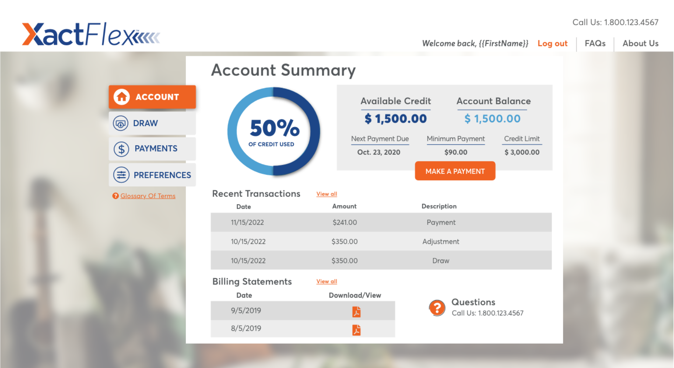
Account Summary
Recent Transactions
| Date | Amount | Description |
|---|---|---|
| 11/15/2022 | $241.00 | Payment |
| 10/15/2022 | $350.00 | Adjustment |
| 10/15/2022 | $350.00 | Draw |
Billing Statements
| Date | Download/View |
|---|---|
| 9/5/2019 | |
| 8/5/2019 |
The Situation We Walked Into
Three financial products, XactFlex (line of credit), Ameris Bank (consumer banking), and MaxLend (installment lending), shared the same gap. A customer who logged in landed on an account page: change your password, update your address, manage autopay. Useful for configuration. Silent on the first question anyone has on login, which is where do I stand.
The work introduced a dashboard to all three. The account pages did not go away; they moved under settings. The dashboard became the landing surface, leading with balance, available credit, repayment progress, and key dates. Insight first, configuration one click away.
Three product teams, three palettes, and no shared design system to lean on. The structural call was to ship one grammar, sidebar navigation, summary card, activity table, context rail, and theme each brand on top of it. Same skeleton, three skins.
Three brands. One dashboard structure.
The grammar: sidebar nav · summary card · transactions list · context rail. Same skeleton across XactFlex, Ameris Bank, and MaxLend: palette and data viz change per brand, structure does not.
The Box We Had to Work Inside
- 01THREE BRANDS, THREE PALETTES
XactFlex in orange and blue, Ameris in red and blue, MaxLend in rust and green. The same structure had to look native in each.
- 02LONG-TENURE AND FIRST-TIME USERS
Every product had customers who had logged in for years to reach settings, and customers meeting the new dashboard cold. The layout had to scan fast for the first group and feel guided for the second.
- 03LEGIBLE AT 200% ZOOM
No horizontal scroll at 200% zoom. That budget forced honest decisions about which elements could share a row.
- 04STATEMENTS HAD TO BE FINDABLE
Statement requests were a leading support topic at Ameris. The dashboard had to put statements where a customer would actually look, not under a Documents tab.
- 05NO SHARED DESIGN SYSTEM
Three organizations, three codebases. Each dashboard had to ship standalone, which made the shared grammar a matter of discipline rather than tooling.
The Calls We Made, with Rationale
- 01One structural grammar, three themes
Left sidebar navigation, account summary card at the top of the main column, activity or transactions table below it, an optional right rail for context. Palette, type weight, and surface treatment make each one native to its brand.
- 02“Where do I stand?” above the fold
The summary card is the first thing on every dashboard: available balance, current balance, next payment, key dates. No carousel and no promotion above it.
- 03Sidebar, not top navigation
A sidebar keeps every section one click from the dashboard: settings, statements, transactions, preferences. Top navigation would have bought the dashboard more width and cost that reach.
- 04Statements get their own row at Ameris
A statements table sits on the Ameris dashboard itself, with a download per row, visible on first view. That single placement is the change with the clearest number attached to it.
- 05The right rail carries context, never a required action
Educational callouts and welcome cards live in the rail. Nothing a customer must act on does, so the primary scan path stays clean.
Artifacts and the Path
- 01CATALOGUE THE ACCOUNT PAGE AS IT WAS
Started each brand by listing what the existing account page held. Almost all configuration. Almost nothing that answered where do I stand. That gap was the brief.
- 02DEFINE THE GRAMMAR BRAND-FREE
Sketched sidebar, summary, table, rail as a wireframe with no palette, then stress-tested it against each product: what the summary card must say for a line of credit, a checking account, and an installment loan.
- 03THEME PER BRAND
XactFlex in orange and blue. Ameris in red and blue, with its promotional treatment in the rail. MaxLend in rust and green, with the repayment schedule forward. The grammar held; the dress changed.
- 04MOVE CONFIGURATION UNDER SETTINGS
The surfaces customers used to land on moved to a settings section reachable from the sidebar. The dashboard became the front door.
- 05HOLD THE ZOOM BUDGET
Checked every layout at 200% zoom and trimmed the rail where it pushed the page over.
- 06SHIP, THEN REFRESH ON EACH BRAND'S CYCLE
Each brand shipped its dashboard in one wave and refreshed on its own product cycle, from 2019 through 2022.
What Shipped per Brand, and What It Moved.
- 01
XactFlex
LINE OF CREDIT- FIG. 01BEFORE · AFTERSettings onlyDashboard1st
dashboard for the line-of-credit product; the prior account page was settings only
- FIG. 02REACHED FROM ITDashboardAccount SummaryRequest a DrawOne-Time Payment3
surfaces reached through it: Account Summary, Request a Draw, One-Time Payment
- FIG. 03THE CREDIT READ1
utilization donut as the canonical credit read
- 02
Ameris Bank
CONSUMER BANKING- FIG. 04SUPPORT TICKETS, INDEXED41%
fewer statement-export support tickets after statements moved onto the dashboard
- FIG. 05SAME WIDTH, NO SCROLL100%200%200%
zoom with no horizontal scroll
- FIG. 06ON THE DASHBOARD1
statements table on the dashboard itself, a download per row
- 03
MaxLend
INSTALLMENT LENDING- FIG. 07BEFORE · AFTERSettings onlyDashboard1st
dashboard for the installment product; the prior account page was settings only
- FIG. 08THE LOAN READ1
repayment-progress view as the “where am I in this loan” read
- FIG. 09FROM THE DASHBOARD1
Ready for Next Loan flow surfaced from the dashboard for returning customers
All three dashboards are in production and are the surface customers land on; the old configuration pages sit under settings. The Ameris statement number is the one I cite because it is the one that was measured. The rest of the outcome is structural: three products, one grammar, and refreshes that did not require rethinking the layout.
What I'd Do Again, What I Wouldn't
- The grammar was the decision
Three brand teams and no central system, and the dashboards still read as cousins. The shared structure made later refreshes cheap: a palette change never forced a layout change.
- I should have built the system
We shipped three themes of one dashboard by discipline. A real token system would have made every refresh since cheaper. It is the bet I wish I had made at the start of the program rather than at the end of it.