
Mobile App
Two new lending apps, designed in parallel by one team, on one versioned component library with a theme per brand.
- CLIENT
- Level Up Funding · MaxLend
- YEAR
- 2019–2022
- ROLE
- Design Lead
- DURATION
- 2019–2022 · several release cycles
- TEAM
- Designer (me) · 1 PM per app · engineering shared across both
- STACK
- Adobe XD · Figma
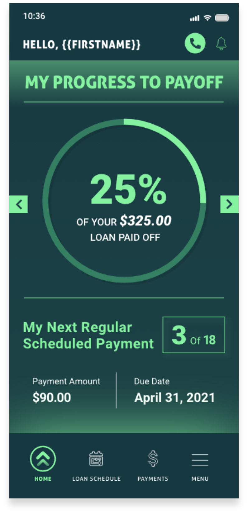
Use the carousel arrows on Home to step through progress views. Switch to Loan Schedule, Payments, or Menu via the bottom tab bar.
The Situation We Walked Into
Level Up Funding and MaxLend launched as new lending products at the same time, and both needed a first mobile app as part of the launch. Neither had a web app to translate or a legacy mobile surface to improve. Two 0-to-1 builds, in parallel, with one design team.
The products ask different questions. Level Up Funding is small-business origination: the customer is mid-application and wants to know what happens next. MaxLend is an installment-loan account: the customer is in repayment and wants to know where they stand. The brief was to design both without building two design systems, with a shared layer that would let each app move at its own pace after launch.
The Box We Had to Work Inside
- 01TWO APPS, ONE TEAM
No additional headcount for the second product. Sharing at the component level was the only way to ship both. Sharing whole screens was ruled out, because each app needed its own story on the home surface.
- 02TWO BRANDS
Level Up Funding is lime on navy. MaxLend is rust and green. The same component had to render in both without a code branch per brand.
- 03TWO MENTAL MODELS
Origination customers look forward: what now? Account holders look back: how am I doing? The home screens had to honor that difference while everything beneath them stayed common.
- 04A LIBRARY EACH APP COULD PIN
When one app needed a component to change, the other could not inherit the change by accident. Per-app versioning was a requirement from the start, not an afterthought.
The Calls We Made, with Rationale
- 01Twelve shared components, versioned
The library covers the primitives both apps are built from: navigation and header, buttons, status pills, account cards, payment rows, the progress donut, slider, calendar, modal, and the smaller list and toggle pieces. Each component carries a version, and each app pins the version it ships.
- 02Level Up Funding's home is action-forward
The home surface leads with the next step: re-borrow, payoff progress, the scheduled payment. History sits behind a secondary tab. Lime callouts mark the actions.
- 03MaxLend's home is summary-forward
The home surface leads with the state of the loan: repayment progress, next payment date, total paid. Actions are one tap away and deliberately not first.
- 04Theme tokens, not branded components
One status pill renders lime on navy in Level Up Funding and rust on green in MaxLend by reading its colors from the app's theme tokens. There is no Level Up pill and no MaxLend pill. One component, two themes.
- 05One bottom-navigation shape
Both apps carry a four-item bottom navigation: Home, Payments, Documents, More. The contents differ; the shape does not. A customer who meets both products learns the layout once.
Artifacts and the Path
- 01MAP THE TWO NARRATIVES
Before any primitives, wrote down the customer's job on each app: what's next, versus where am I. That asymmetry belongs on the home screen and nowhere else. The shared layer underneath had to be indifferent to it.
- 02BUILD THE LIBRARY BEFORE THE SCREENS
Started with the shared library rather than either app's surfaces. A component is cheaper to iterate than every screen that uses it. Twelve primitives, each specified with states, sizes, and theme bindings.
- 03COMPOSE THE APPS FROM IT
With the library in place, each app's screens became compositions of existing components plus app-specific copy. A new screen was rarely a new component.
- 04THEME IT TWICE
Two token sets, one per app, and a library that reads from them. The same component renders correctly in both palettes with no per-brand fork.
- 05SHIP IN WAVES
Onboarding first, then the dashboards, then payments, then the secondary surfaces, in both apps together. Each wave proved the shared layer before the next one leaned on it.
What Shipped and What It Moved.
- FIG. 01ONE LIBRARY, TWO APPSShared libraryLevel Up FundingMaxLend12
shared components, documented and versioned, each app pinning its own
- FIG. 02APPS SHIPPEDLevel Up FundingMaxLend2
apps shipped from the same library
- FIG. 03SAME TOKENS, TWO VALUESLevel Up FundingMaxLendBGINKSPOTR2
themes, one per brand, applied through tokens rather than forks
- FIG. 04BOTH APPS1
bottom-navigation shape across both products
Both apps shipped on the shared library, and components added since are versioned the same way. The action-forward and summary-forward split has held: each app leads with the question its customer is asking, and the layer underneath stays common.
The claims in this study are structural. It does not cite usage or support numbers for either app.
What I'd Do Again, What I Wouldn't
- Versioning was the underestimated work
The components came together quickly. Documenting versions, agreeing what counts as a breaking change, and making per-app pinning behave took more rounds than any component did. It was worth it. The apps still share one library.
- Theme first, then components
We retrofitted theming halfway through the library, and a few components carried hardcoded colors longer than they should have. Build the token layer before the first component. It is the right discipline for any shared layer.